Your Cover Belongs in a Grid, Not in a Gallery
Your cover is the only marketing material every single reader will see. Not your blurb, not your website, not your Facebook post. Your cover. And yet most self-published authors spend ninety percent of their effort on the manuscript and five percent on the thing that actually makes someone pick it up.
The biggest mistake isn’t a bad cover. It’s a cover that doesn’t belong to a genre. Readers scan covers in under two seconds, and in those two seconds they’re asking one question: what kind of book is this? If your cover doesn’t answer that question instantly, they move on.
Study the top hundred books in your category on Amazon. Not the new releases, the bestsellers. You’ll notice they share a visual vocabulary. Thrillers use bold sans-serif typography and dark palettes. Romance uses illustrated couples and script fonts. Literary fiction uses minimalist typography with lots of negative space. These conventions aren’t creative limitations. They’re reader signals.
The best covers don’t try to illustrate the story. They promise an experience. A silhouetted figure on a dock at dusk promises mystery. A pair of bare feet on a kitchen tile promises domestic drama. The image doesn’t need to depict a scene from your book. It needs to make the reader feel the emotion your book delivers.
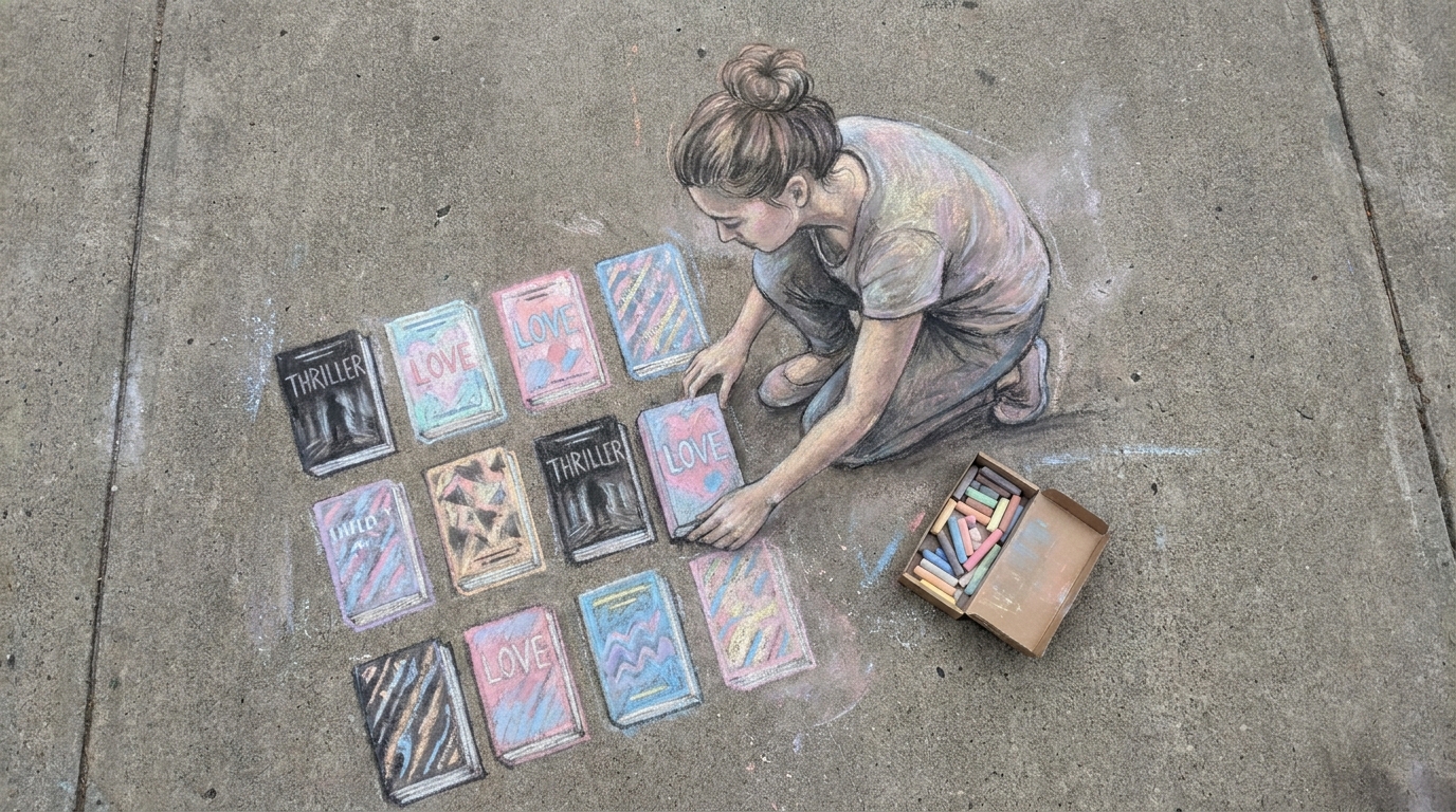
Open the top 100 in your Amazon category. Screenshot the first twenty covers. Arrange them in a grid. What colors repeat? What typography dominates? Where do they place the author name? That grid is your brief. Your cover doesn’t need to look like all of them, but it needs to look like it belongs in the grid. A cover that stands apart from its category isn’t being original. It’s being invisible.
Writing Academy has 22 courses and 640 lessons covering craft from every angle—structure, POV, voice, pacing, scene work, and more. All included with lifetime access for just $199. Browse the courses here.