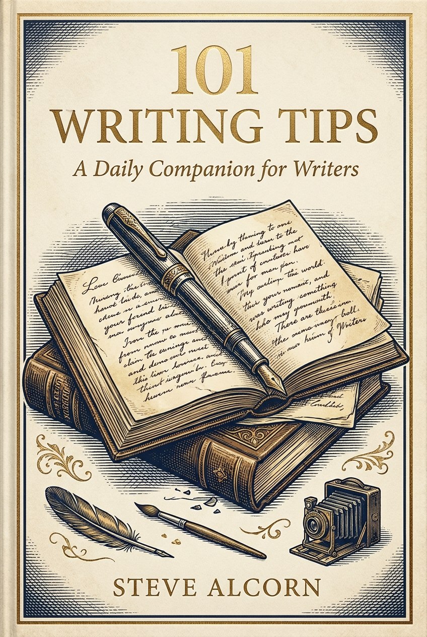
Your Cover Is a Thumbnail First
Ask a hundred authors whether they need an editor, and ninety-nine say yes. Ask whether they need a cover designer, and half of them reach for a design app.
While nobody was watching, the place readers meet your cover moved. It’s under an inch wide now, on a phone, mid-scroll. The cover’s job is to stop the right thumb.
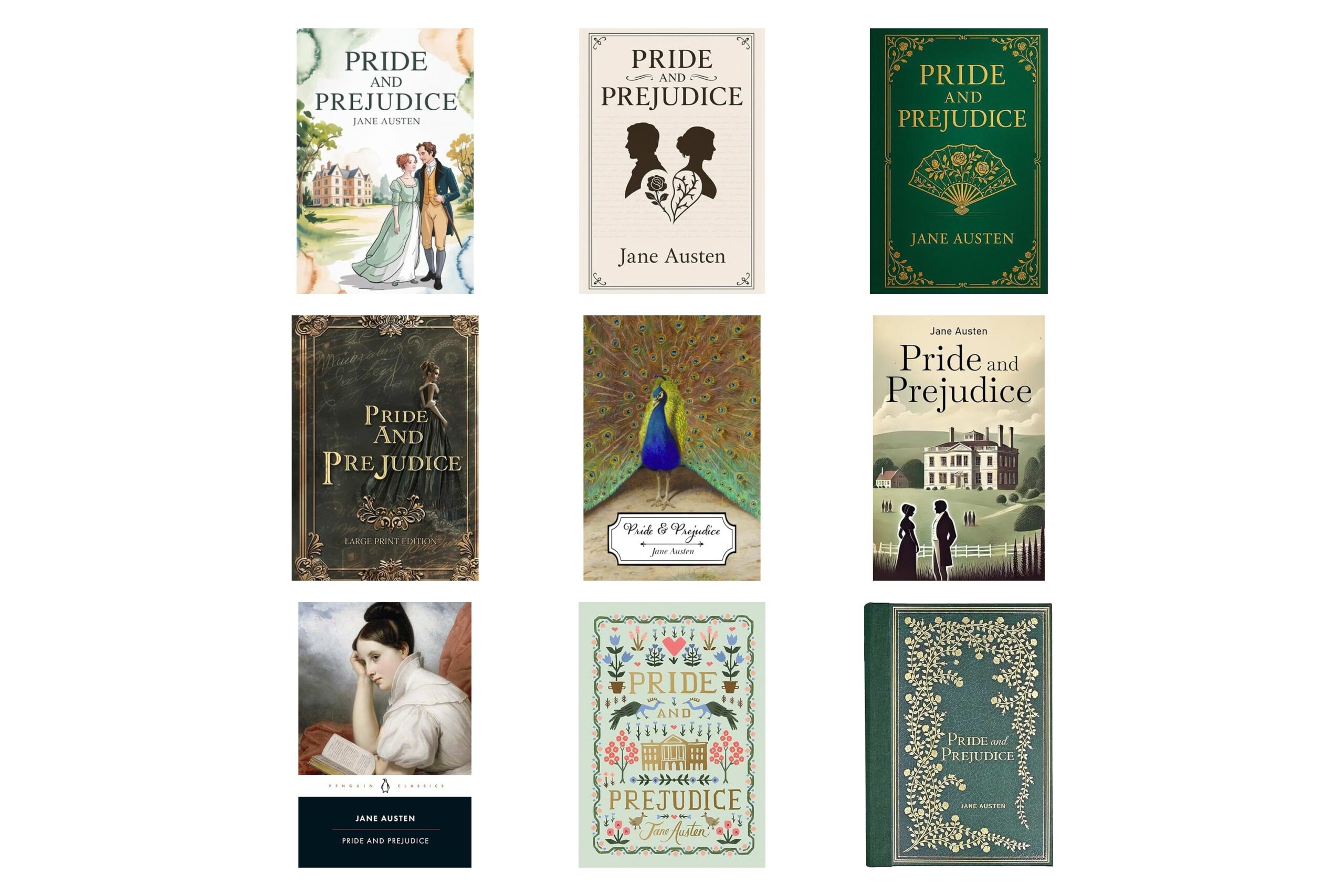
At that size, your gorgeous artwork is a smudge. What survives is text: the title, the name, how the type sits inside the image. Ricardo Fayet wrote How to Market a Book, and he says he can spot a homemade cover 99 times out of 100. The text gives it away: pasted on, wrong weight, unreadable at thumbnail size.
The other amateur move is plot on the cover. The castle where the climax happens, the dragon, the sword, the sigil. A cover carries vibes, not plot, and genre readers shop by vibes. The cozy fantasy reader should stop scrolling before she reads a single word.
Blend first. A cover that sits comfortably inside its genre is 80 percent fine forever. A cover that breaks the mold badly is a disaster, and you don’t get the time back. Stand out only when a genuine genre designer can do both in the same cover.
Put your cover on your phone, shrink it to thumbnail size, and set it beside the current bestsellers in your genre. Hand the phone to someone for five seconds. If they can’t name the genre, a browsing reader can’t either, and the type is where you fix it.